
The context
Dose is a specialty coffee shop in Bucharest, established in 2016. What began as a small neighborhood café quickly grew into a multifaceted business: roasting its own beans and serving a full brunch menu – all while staying rooted in quality and community.
The old visual identity was essentially just a logo – designed by the founder in the early days and applied repeatedly across all materials. While the business had grown, the brand remained stuck in its early-stage form.
The solution
We built the new identity around the Brand Idea “Doses of Joy,” using flexible messaging to bring a personal voice to every touchpoint.
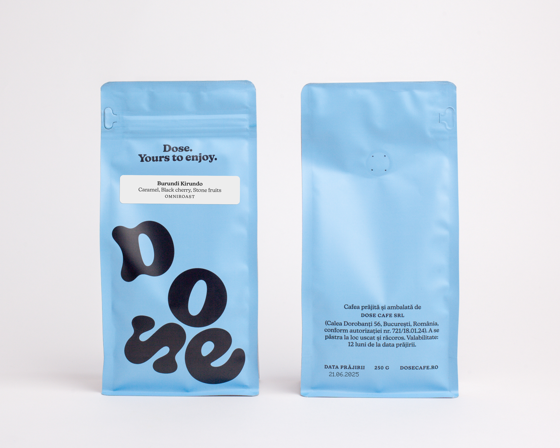
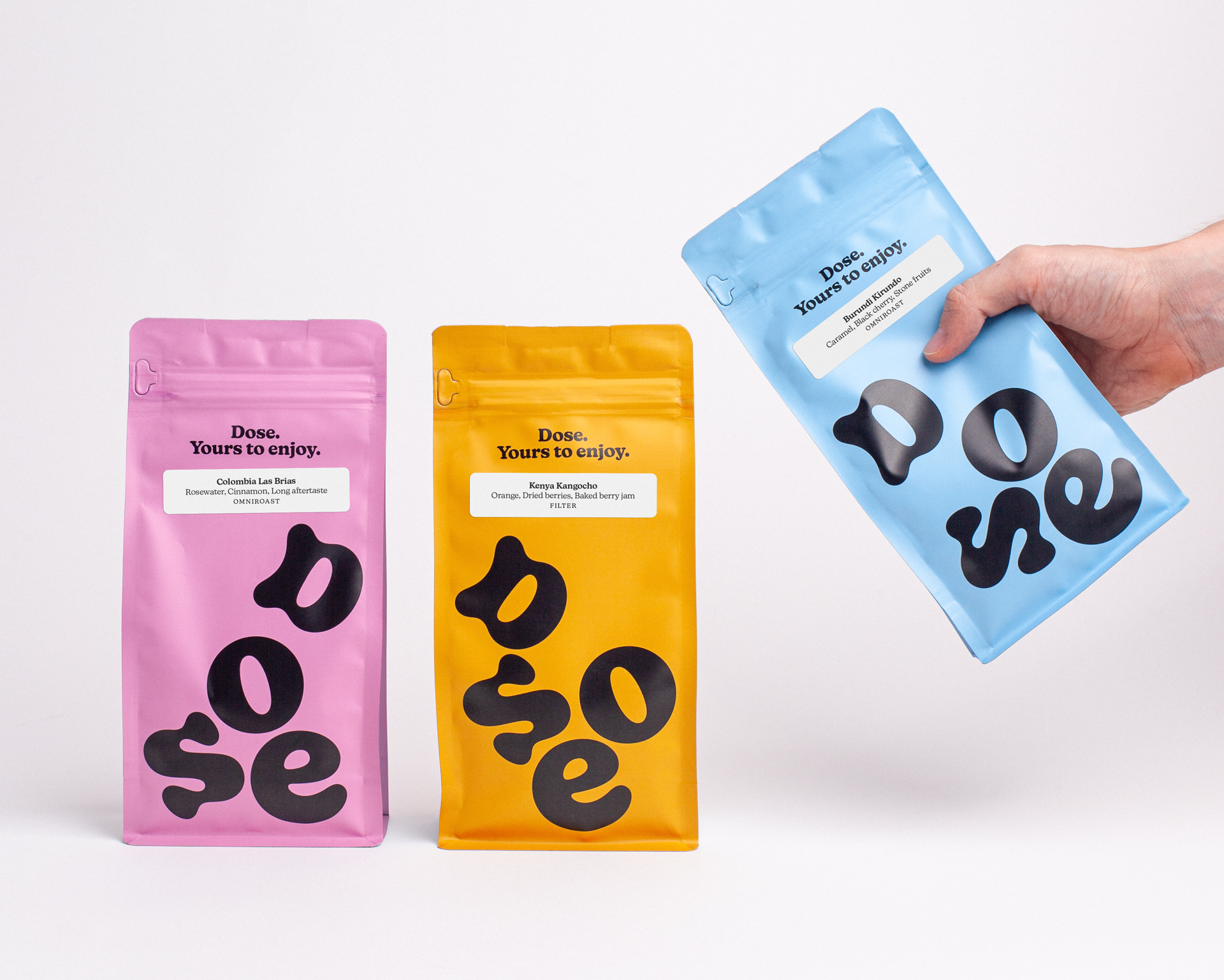
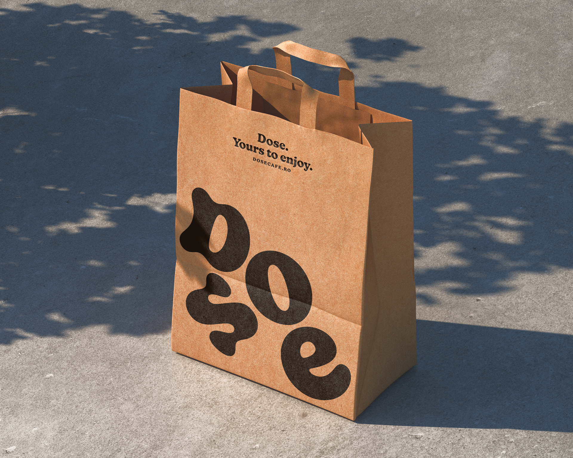
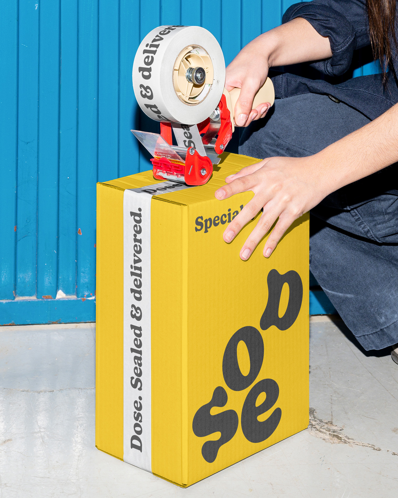
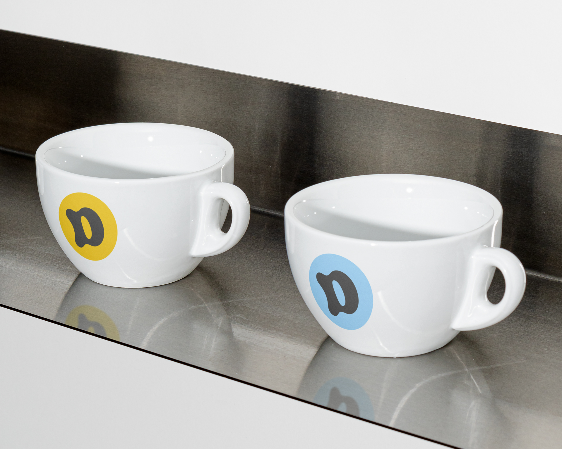
The Dose logo has a mind of its own – and an unhealthy caffeine addiction. From calm and steady to jittery and wide awake, the logo mirrors the very thing it represents: coffee, in all its glorious moods. It’s a playful, living mark that keeps things fresh without losing its core.
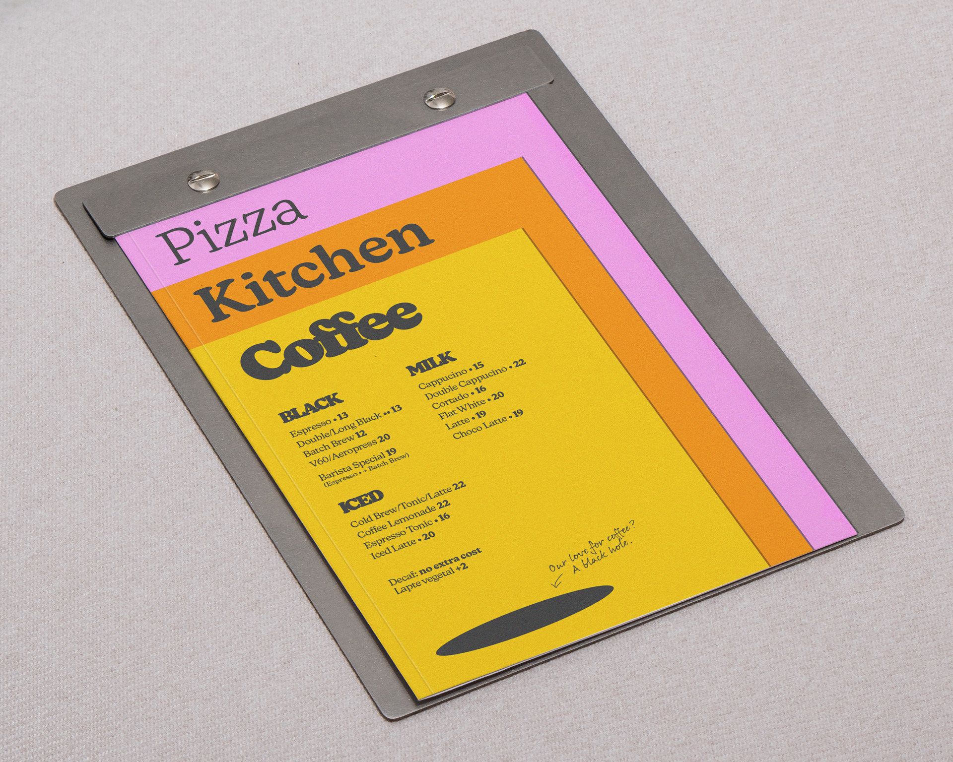
The color palette breaks free from the usual specialty coffee tones. Goodbye white, beige, and black. Hello vibrant, feel-good colors that wake you up before your espresso does.
The primary typeface is soft, chunky, and charming – like a cozy armchair with opinions. The secondary one, a casual handwritten style, pops up like a friend’s note, adding a personal, human touch. Scribbles and doodles sneak into the mix too, because not everything needs to be polished to be perfect.
With just a few well-chosen elements used consistently and playfully, the identity feels familiar, approachable, and always ready to start a conversation.