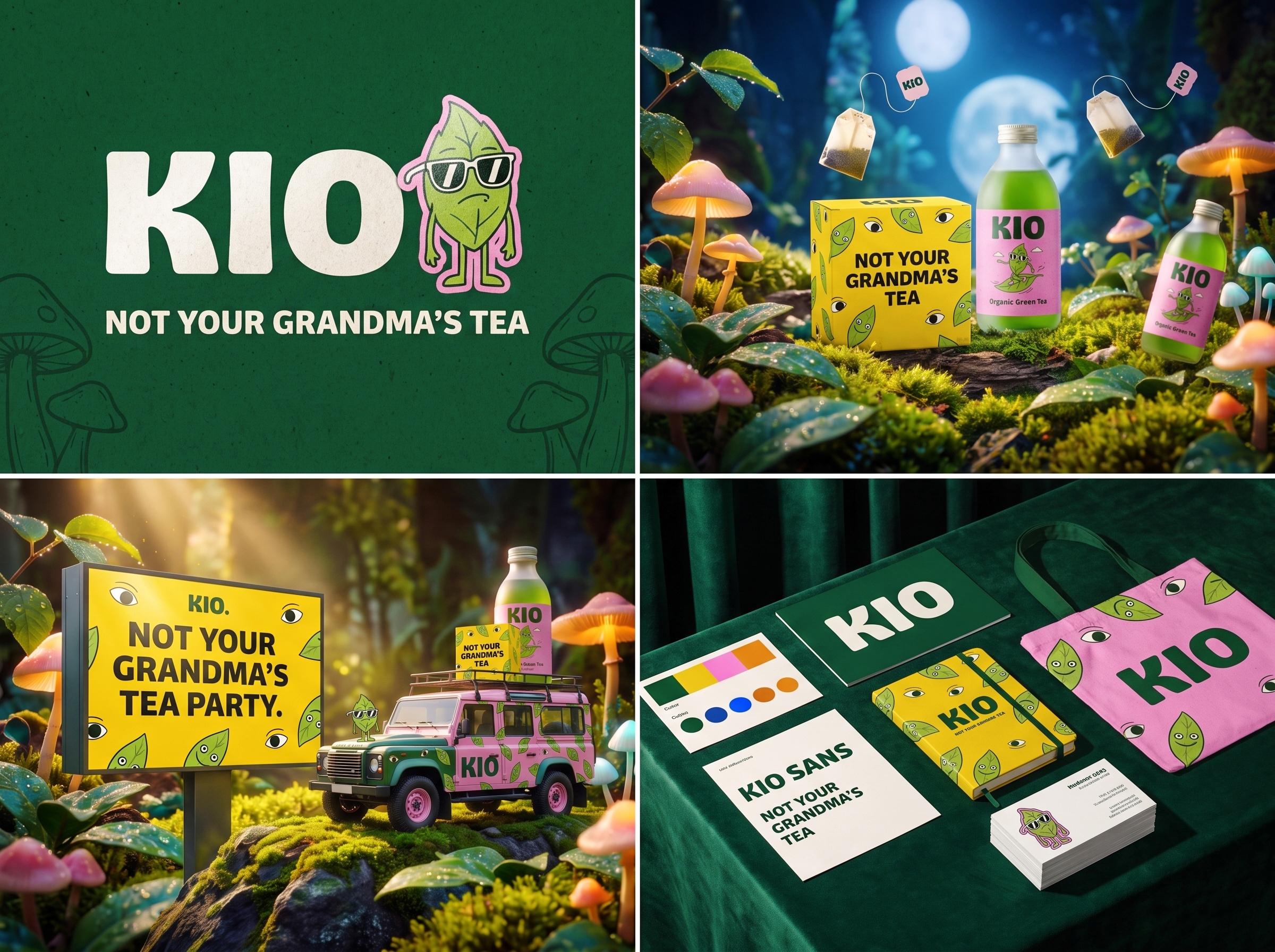


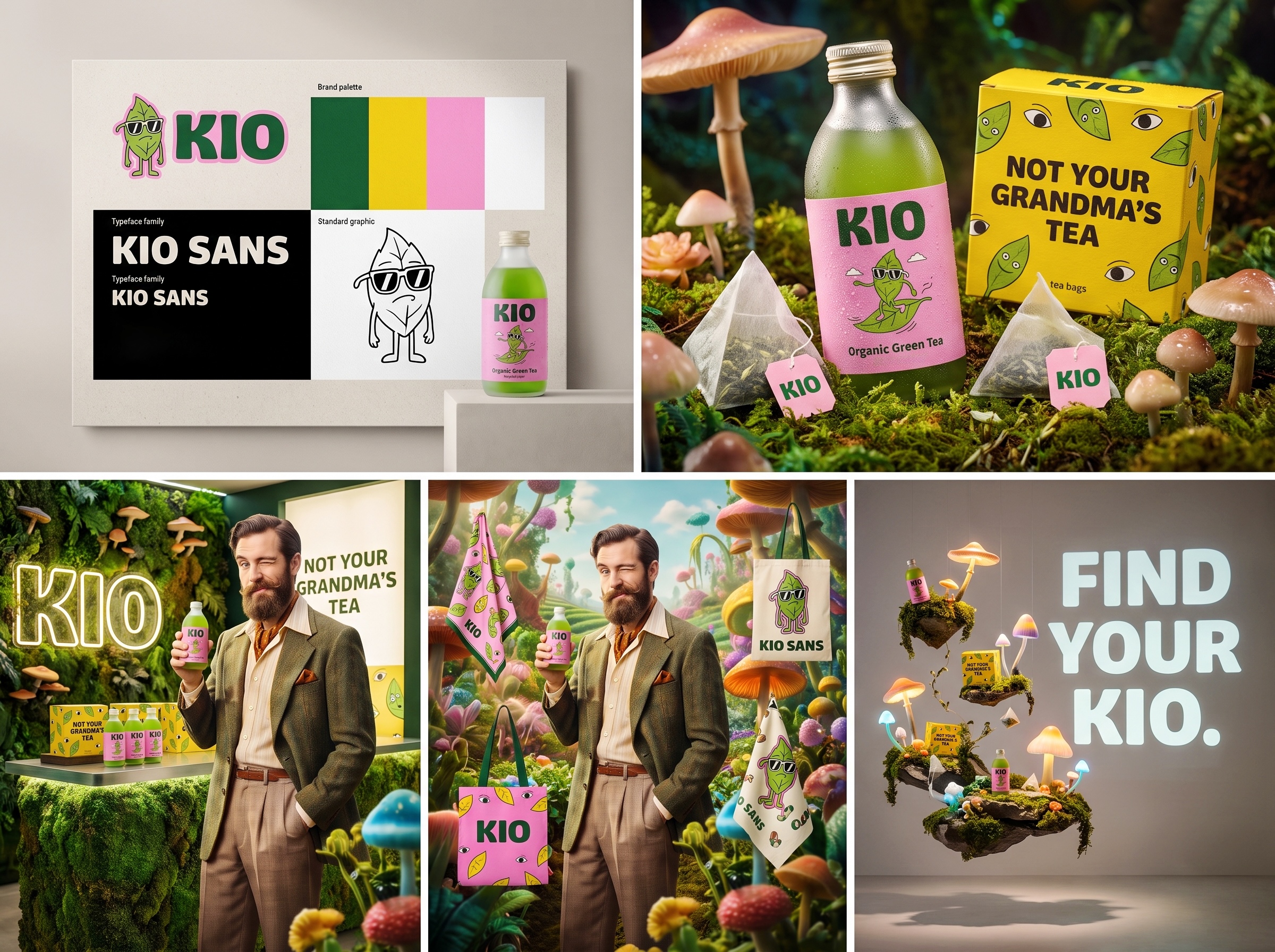
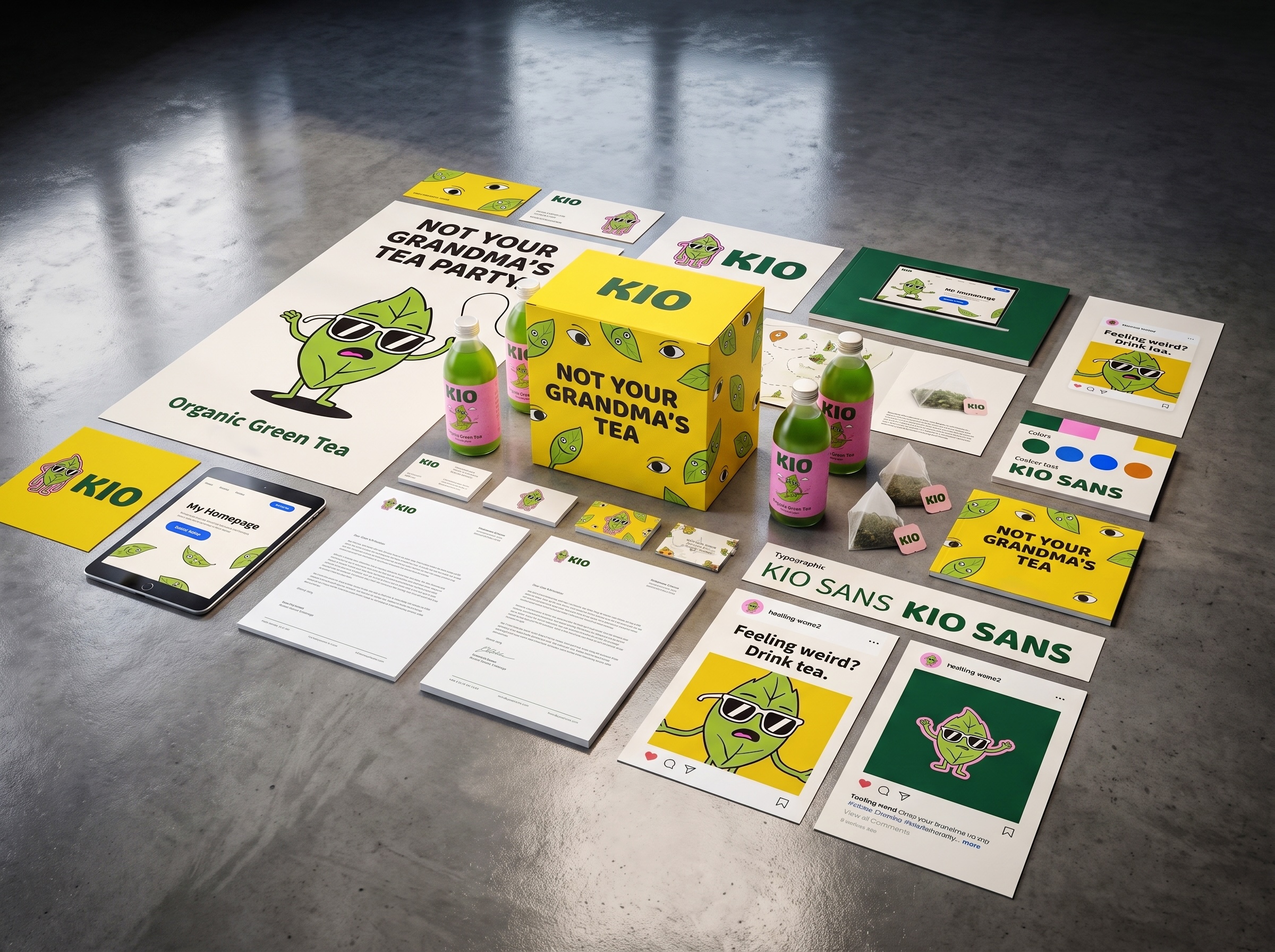

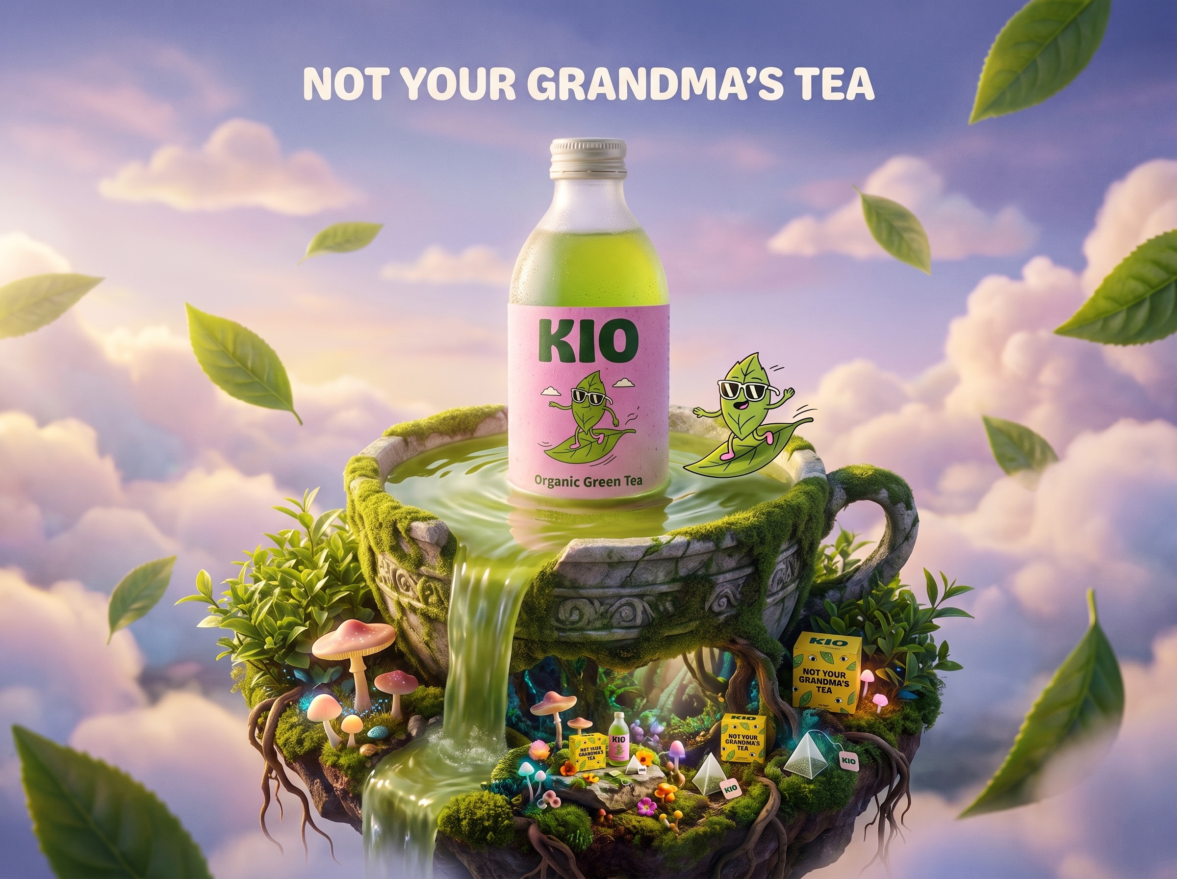
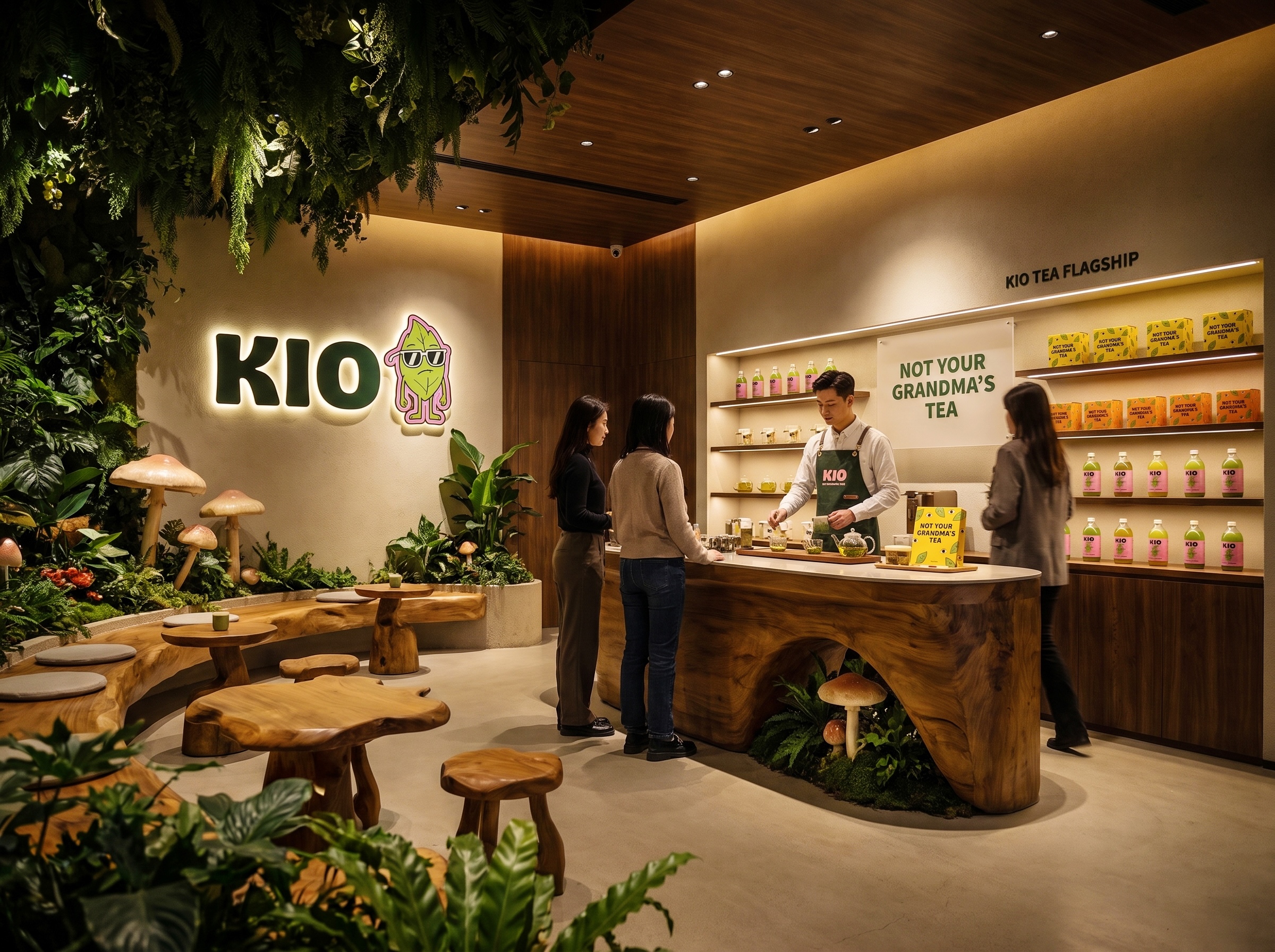
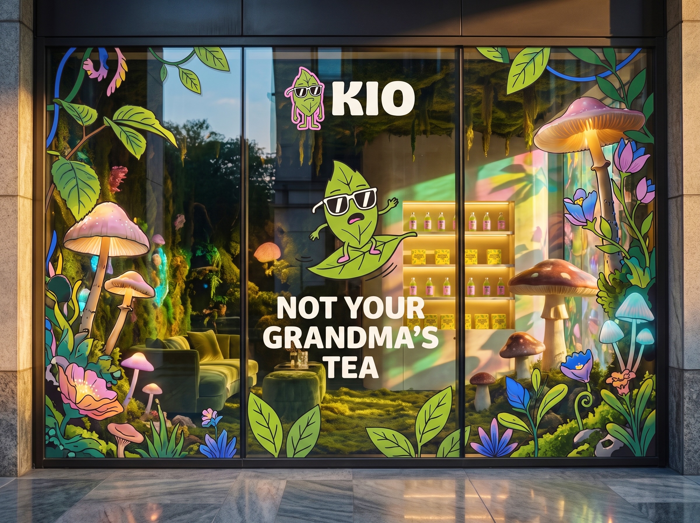
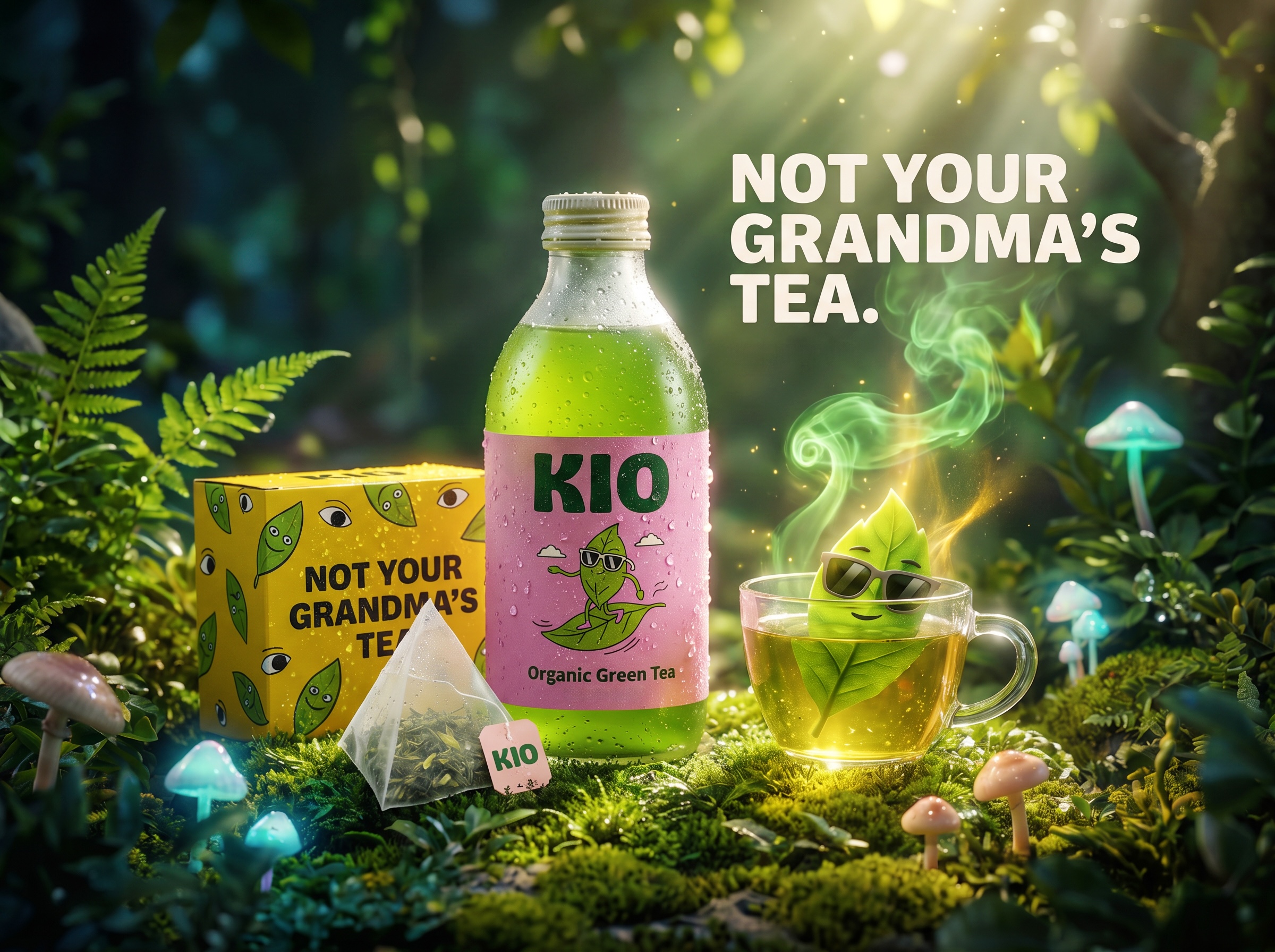
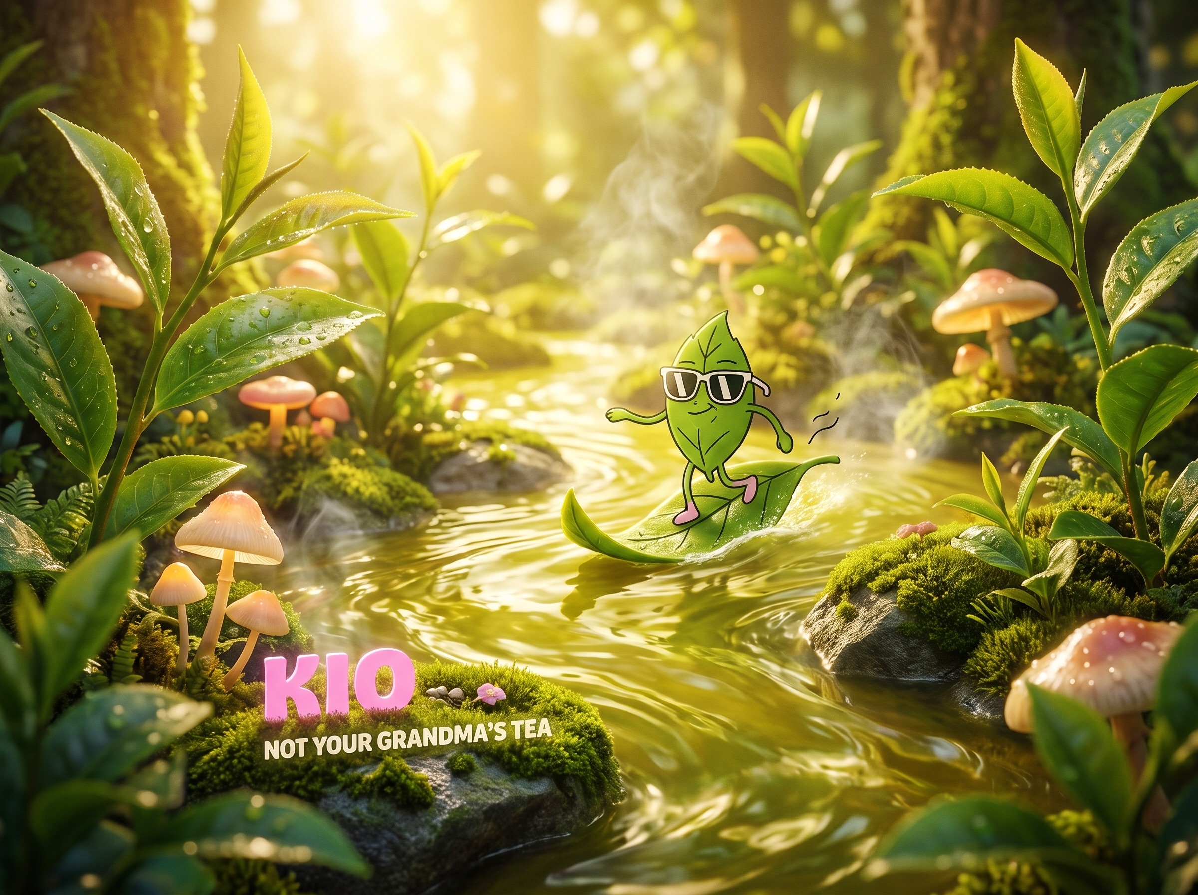

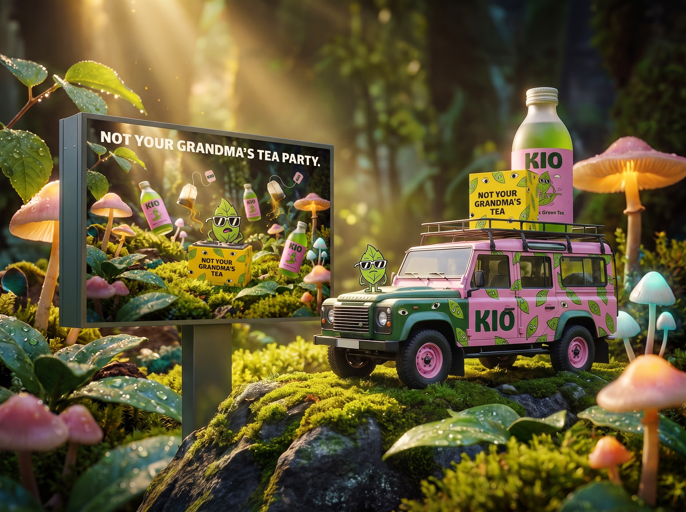
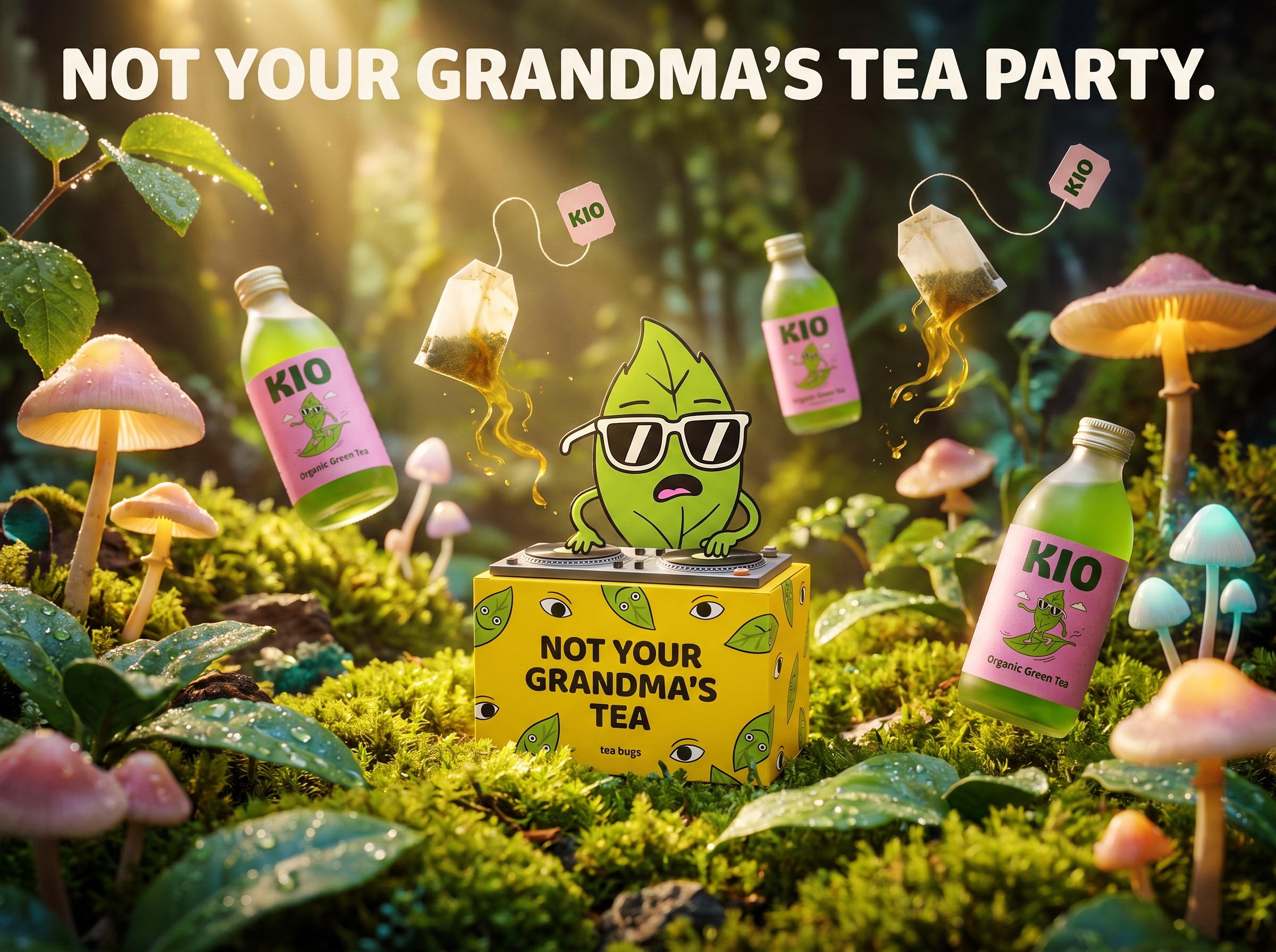


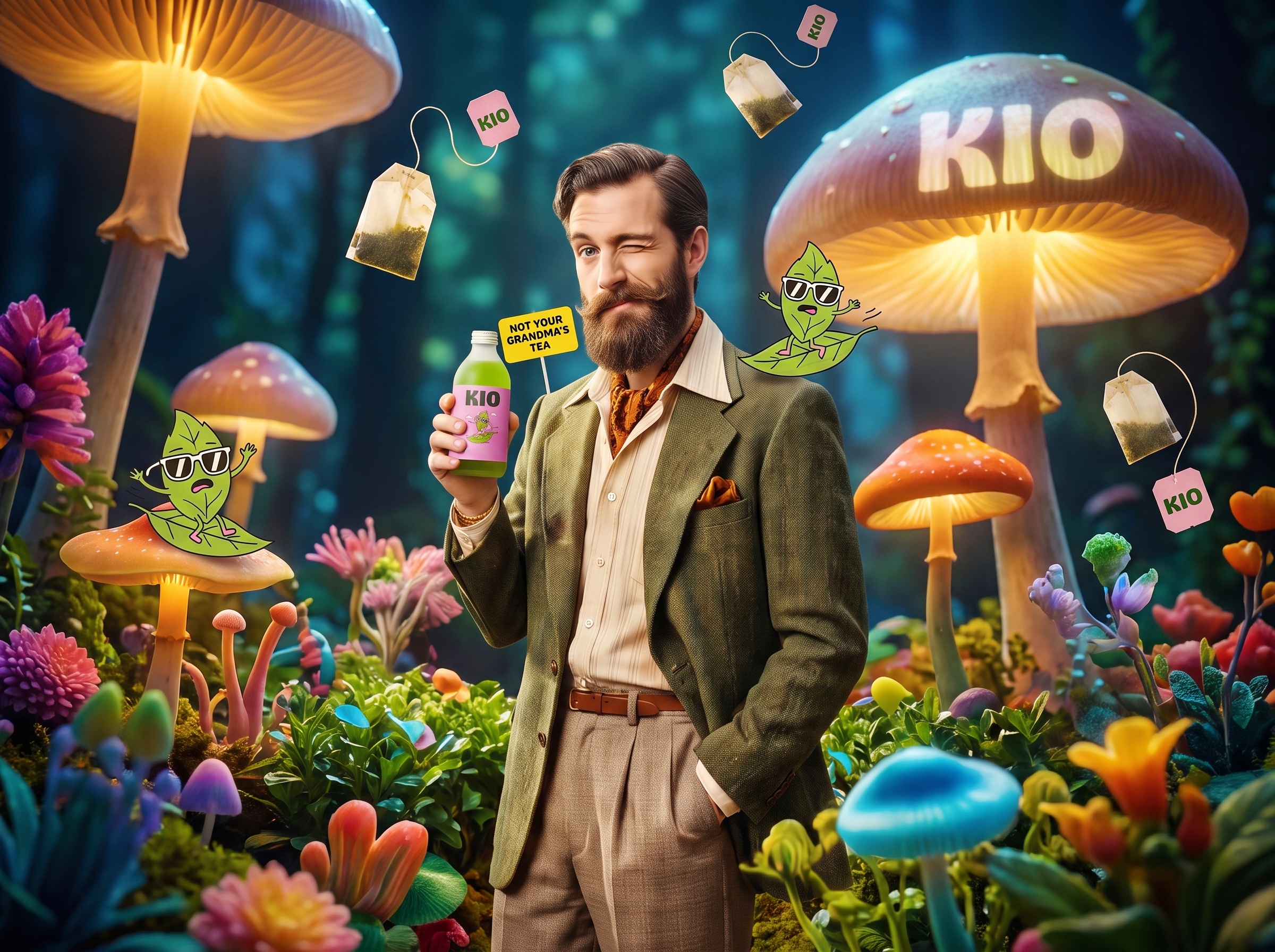
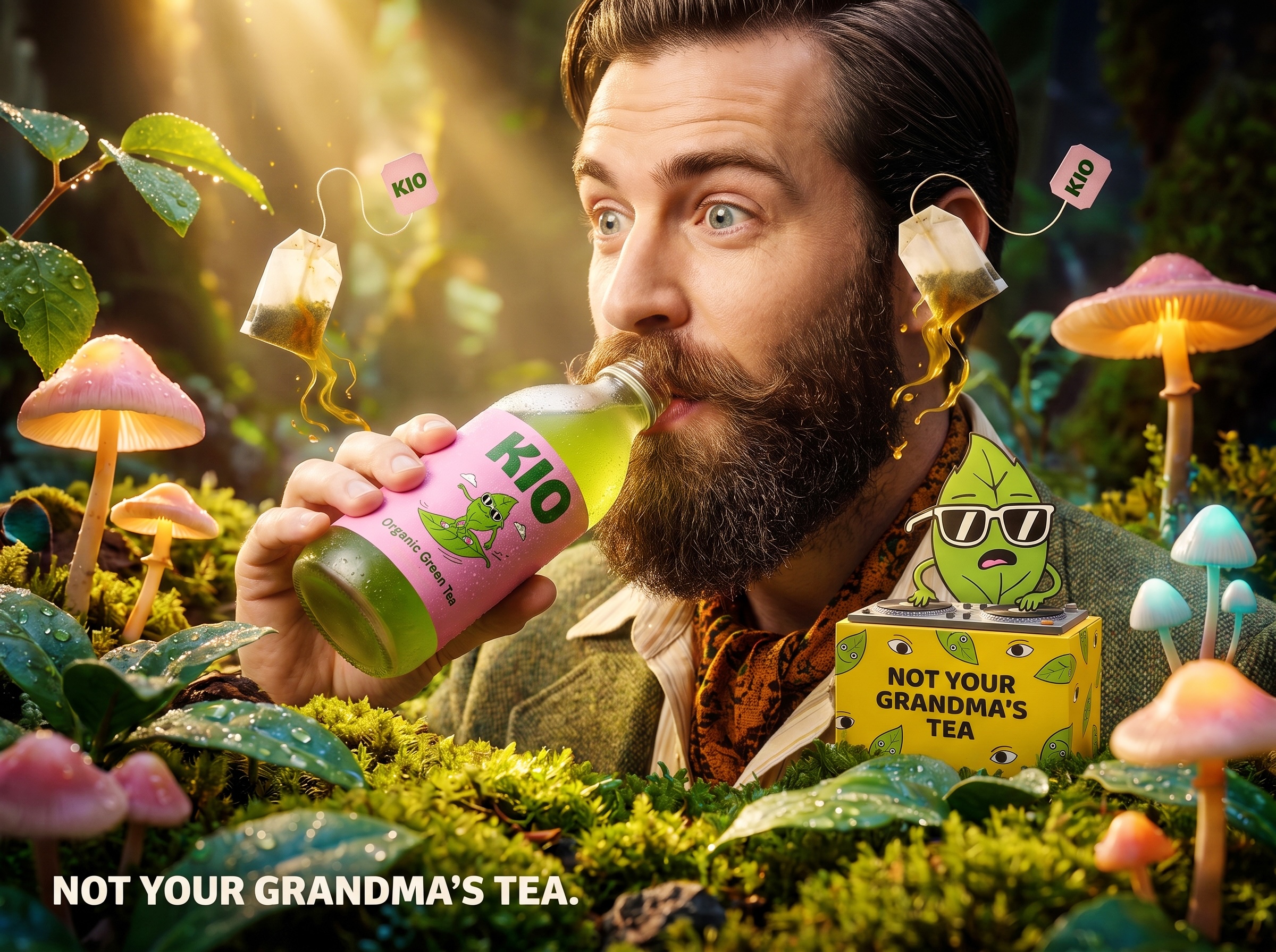
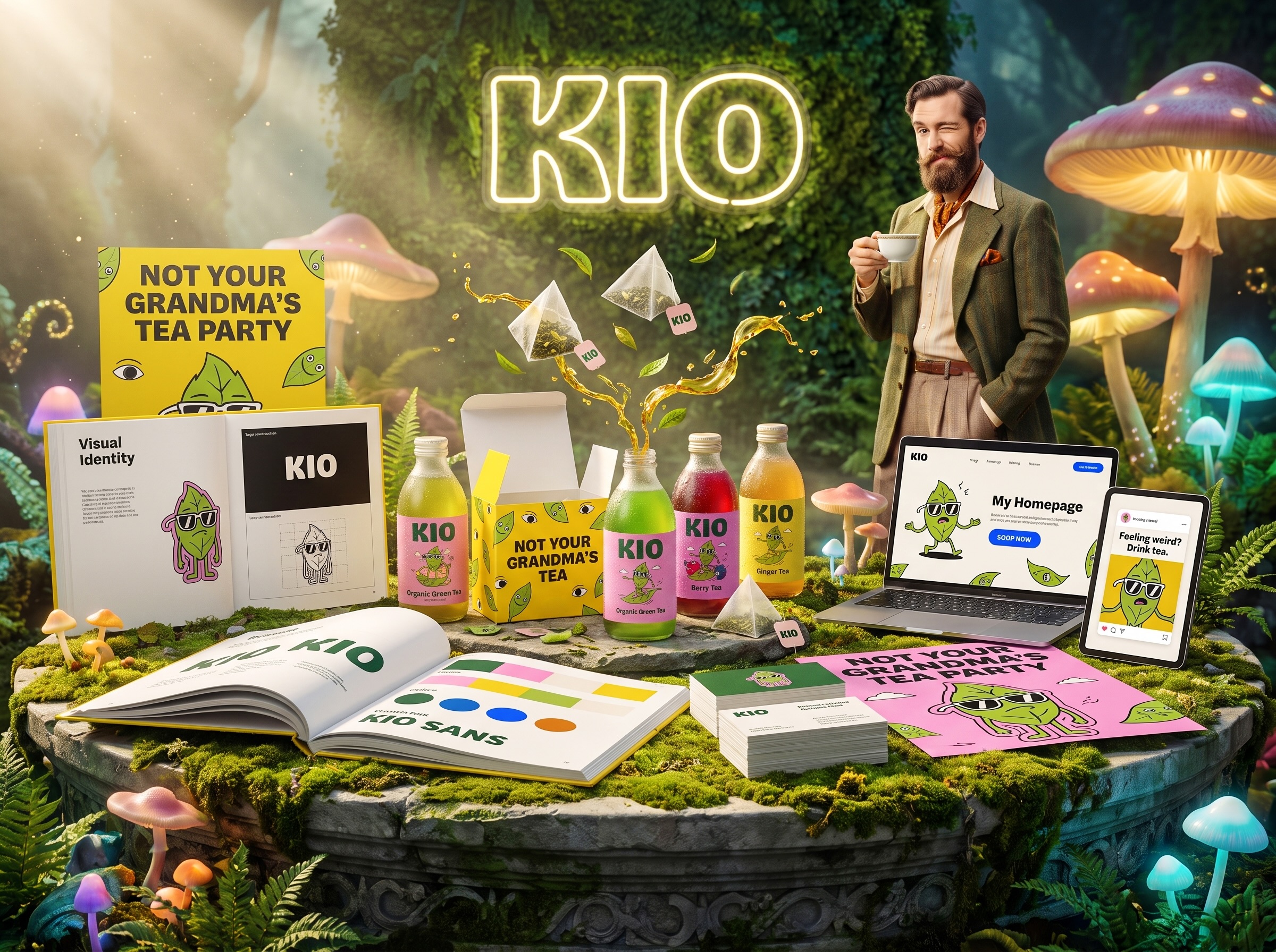

KIO is a next-gen organic tea brand built to break the predictable visual language of the tea aisle. Instead of earth tones and heritage typography, the packaging uses a pop collision of forest green, Barbie pink, vibrant yellow, and cobalt blue, anchored by a mascot: a leaf wearing sunglasses, surfing.
The bottles use translucent frosted glass with recycled paper labels in high-contrast pink and dark green, letting the bright tea show through. The tea bag boxes are covered in playful eye and leaf patterns in high-visibility yellow, carrying the slogan “NOT YOUR GRANDMA’S TEA” across the front. Custom heavy sans-serif typography (KIO SANS) gives the brand a loud, streetwear-adjacent voice that feels closer to a fashion drop than a health product.
The visual system treats organic tea as a pop art object rather than a wellness commodity. Sustainable materials are present, but they don’t dictate the aesthetic. The packaging is designed to be picked up, photographed, and shared.
Designed by Up-Brands Design Agency, based in the Greater Bay Area, China.